The Divide Project Evaluation

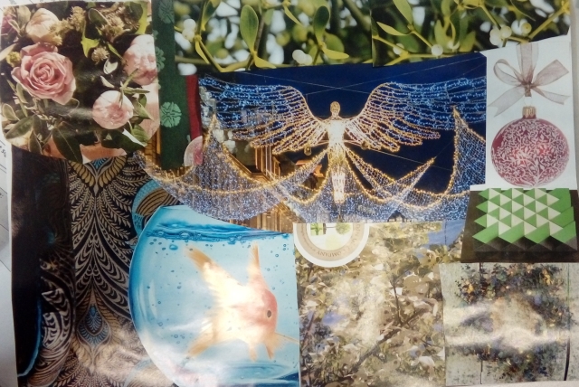
For this project, we produced one photo but split it into quarters allowing us to do different, types of photography onto each A3 quarter. The top left quarter of the photo is a hand painting of an original black and white photo, I personally found this difficult as my hand is not very steady when holding a paintbrush. If I was going to do it again, I would use FotoMask, so that I do not go over onto the borders or onto the areas I do not want to go onto. The top right is just the original black and white photo, this was developed in the darkroom, personally, I think this is the best quarter of the final project, as I believe that the aperture was perfect for the image. The bottom left photo is a photogram, which basically is an object/fabric/material over the image which allows the for a white mark on to the completed image. I would have personally made the photo darker like the top left one if I had more time so that it fitted in better. The problemis that I exposed the light to the photo paper for too long. To correct this I would have to do a test strip, this would allow me to test and calculate the best amount of time to allow light to hit the paper. The bottom right image is a blue toner Image, this is where the photo is dipped into, blue toner, this turns the photo blue and makes the whites in the image to become brighter, depending on how long you leave it in for. I would have liked to have made the white areas whiter, so in future, I will choose a better quarter that has more white areas, as the image I chose did not have very clear whites.

CRC Location Scouting

This slideshow requires JavaScript.

Reflecting back on this activity, I found that looking around the collage that their are many different shapes and colours. Much of the collage follows simple colour scheme, such as the different types of greys. This activity gave me the ideas of what area of the college I would like to take my final images.

Basic Camera Parts

Lens

The lens is one of the most vital parts of a camera. The light enters through the lens, and this is where the photo process begins. Lenses can be either fixed permanently to the body or interchangeable. They can also vary in focal length, aperture, and other details.

Viewfinder 

The viewfinder can be found on all DSLRs and some models of digital compacts. On DSLRs, it will be the main visual source for image-taking, but many of today’s digital compacts have replaced the typical viewfinder with an LCD screen.

Body 

The body is the main portion of the camera, and bodies can be a number of different shapes and sizes. DSLRs tend to be larger bodied and a bit heavier, while there are other consumer cameras that are a conveniently smaller size and even able to fit into a pocket.

Shutter Release

The shutter release button is the mechanism that “releases” the shutter and therefore enables the ability to capture the image. The length of time the shutter is left open or “exposed” is determined by the shutter speed.

Aperture

The aperture affects the image’s exposure by changing the diameter of the lens opening, which controls the amount of light reaching the image sensor. Some digital compacts will have a fixed aperture lens, but most of today’s compact cameras have at least a small aperture range. This range will be expressed in f/stops. For DSLRs, the lens will vary on f/stop limits, but it is usually easily defined by reading the side of the lens.  There will be a set of numbers stating the f/stop or f/stop range, ex: f/2.8 or f/3.5-5.6. This will be your lowest settings available with that lens.

Image Sensor

The image sensor converts the optical image to an electronic signal, which is then sent to your memory card. There are two main types of image sensors that are used in most digital cameras: CMOS and CCD. Both forms of the sensor accomplish the same task, but each has a different method of performance.

Memory Card

The memory card stores all of the image information, and they range in size and speed capacity. The main types of memory cards available are CF and SD cards, and cameras vary on which type that they require.

LCD Screen

The LCD screen is found on the back of the body and can vary in size. On digital compact cameras, the LCD has typically begun to replace the viewfinder completely. On DSLRs, the LCD is mainly for viewing photos after shooting, but some cameras do have a “live mode” as well.

Flash

The on-board flash will be available on all cameras except some professional grade DSLRs. It can sometimes be useful to provide a bit of extra light during dim, low light situations.

User Controls

The controls on each camera will vary depending on the model and type. Your basic digital compacts may only have auto settings that can be used for different environments, while a DSLR will have numerous controls for auto and manual shooting along with custom settings.


Taken from …

http://www.steves-digicams.com/knowledge-center/how-tos/photography-tips/10-basic-camera-parts.html

Hand Painting

What you need

  • Water
  • Brushes
  • Inks/Dyes
  • Paper towels
  • Spare print to test

Method

  1. Thoroughly drench your brush with water.
  2. Pick up a tiny bit of ink from the top edge of the bottle
  3. Test out the strength of the dye on your scrap image. You don’t want it to be dark, you want it to be really watery and pale. (if its too saturated with ink it will make dyed saturated parts)

Tips

  • You want to layer up colour
  • Use smaller brushes for adding saturated details
  • You can mix colours on your scrap image-use lots of water + separate brushes for. (So you don’t contaminate the bottles with different colours.
  • If saturated with ink, it will make stain marks. Think about wetting your image a bit first so you can push the colour around better
  • FotoMask is a solution that can be painted on to sections of your image to protect the image from getting any ink on it.
  • You want to dip your brush tip in (you don’t need much) and paint it on to the area you want to mask.
  • Be creative.

Reflecting back onto this activity, I found this activity to be quite interesting, but also at the same time i found it to be quite difficult as I do not have a very steady hand making the process harder than it should be. But if I had thought at the time I could have used the FotoMask so that I did not go over onto the areas of the photo i did not want to cross. I would also like to next time I try this activity, to try a more vibrant colour mix, such as splitting it into thirds so one third of, green, yellow and red.

Photograms

What is a Photogram

A photogram is a monotone (black and white) image that is created in a photographic darkroom by laying objects down on photographic paper that darkens when exposed to any sort of light (accept for the special red-lights in the darkroom). Since the objects make it so that the light cannot get to the paper, you get a negative of what you laid down on the paper, as you can see from these examples.

Related imageImage result for photogramsRelated image


In reflection to this subject I found this area to be quite creative, as the different fabrics and materials you can use can completely, change a photo. The area I most enjoyed about the area of photography was the fact that, how the light passes through different materials.


Blue Toner Process

  • Rinse Print 1-2 Minutes

    We do this in case there is any residue on the print, basically making sure its clean. Also wetting the print briefly helps to let the photo take on the toner

  • Blue Toner 30sec-2Min

    This is where the image will take on the colour, the amount of time you leave it in will determine how blue the image gets, its good to just check it every few seconds as the colour intensifies

  • Rinse Print 1 Minute

    This is to get the excess blue toner off the image

  • Clearing Bath 1-2 minutes

    This is a salt based acidic solution that basically cleans your whites where some of the toner residue may remain. Leave it in longer if the whites are very dirty.

  • Rinse 2 Minutes

    This washes off all the salt that is left on the print, without this step your print will dry dirty, with a scummy type substance stuck to it.

  • Hang to dry

    Probably the most important thing to note, is that all post process paints/toners must be hung to dry, this is because if you put them through the dryer in the darkroom it would not only ruin the dryer, it could potentially start a fire, and also will make all prints going through the dryer come out marked.

In reflection to this area, I found that it was pretty simple, to work as it basically is down to timing and getting the right amount of white into your photo. I personally enjoyed doing this as it showed me what it is possible to change a photo completely so easily.

Photography Research

Introduction

Contextual studies for you as a creative practitioner is a lifetime’s work. It is infinite and only stops when you stop. Studying the past will inform your creative future. All artists, designers and photographers have been inspired by previous practitioners, their peers and the work of current trends of the time.

Edward Weston

Signe Brander

Mark Rothko

Mark Rothko was a black and white artist, who was born on September 25, 1903, and died on February 25, 1970), he index
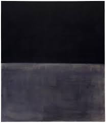
was an American painter of Russian Jewish descent. Although Rothko himself refused to adhere to any art movement, he is generally identified as an abstract expressionist. His work has inspired me, to do my work very simple as it can be perceived in one way but be taken in, in another way. This work shown on the right is called black on grey, which simply shows, black on grey. I like this photo because it shows the resemblance to how close grey is to black. This shows relation which I like.

Franz Kline

American Abstract Expressionist Franz Kline is best known for large black and white paintings bearing abstract motifs set down with strident confidence. He started out as a realist with a fluent style that he perfected during an academic training that encouraged him to admire Old Masters such as Rembrandt. But after settling in New York and meeting Willem de Kooning, he began to evolve his signature abstract approach. By the end of his life, he had achieved immense international recognition, and his unusual approach to gestural abstraction was beginning to influence the ideas of many Minimalists.

http://www.theartstory.org/artist-kline-franz.htm

Franz Kline is most well know for his black and white paintings. Most of them being linked tpnt_kline_franz_3o the New York, cityscape. The photo on the right is called, “four square” which was painted in 1956. It is showing us Franz black and white angular experimentation. I like this art piece because it is well structured, in its composition. I also dislike the painting due to me not really understanding what, the painting is trying to tell me.


Comparing

These artists have helped me produce work as, their views on art has helped me to narrow down my choices for my work, such as Franz Kline who has inspired me to do my work as simple as possible. Artist research is important to me as it gives me ideas, which I have may not of thought of, this gives me a wider perspective on what is possible. Other forms of research may have been better for me, such as mood boards or image scouting, but in my personal opinion i find that artist research suits me better, as it gives more to think about. However mood boards help me decide whether something will work or not such as mixing colours together. Like through my mood board which is shown below, helped me understand that the colours, dark blue and gold suit together.

20180307 103933


Bird Eye View (Jason Hawkes)

This slideshow requires JavaScript.

Jason Hawkes

Jason specializes in aerial photography, is based just outside London in the UK, and works worldwide. He shoots from single days for architectural visualization companies to organizing multi shoot ads for large ad agencies, annual reports, and even whole image libraries for branding agencies, working all over the world and organizing all helicopters, production and permits needed. His clients include brands such as Apple, Virgin Atlantic, Amazon, Rolex, Microsoft, HP, Citi, Siemens, Red Bull, Nike, Coca Cola, Nokia, BT, Conde Nast, HSBC, NatWest, Ford, American Airlines, Toyota, Smirnoff, Mitsubishi, Samsung, National Geographic, O2 and BP. He has produced over 50 aerial photographic books for publishers such as the BBC, Random House, Dorling Kindersley and Harper Collins.

In my personal reflection, I find Jason Hawkes photography to be visually stunning, as he focused on the contrast in colours in the bird eye view. His photos of Los Angeles, I find the most interesting as of the night photography as the neon colours reflect the cities presence.

Making a Print

  1. After developing, your test strip will look like it is getting darker the further the image you go down. Whichever section looks best tells you how long of an exposure you will need for a perfect print.
  2. Set your timer to the appropriate time.
  3. Move the red light to cover over the lens. Be sure to remove it only when your ready to expose your paper.
  4. To make perfect boarders open the masking frame all the way push a piece of paper the size you will be printing at, into the corner pf the frame, then close it.
  5. Using a pen, mark the upper left hand corner of the paper, tracing where the fixed frame is.
  6. Now, lift the frame up again and spin the paper so the mark you made is in the lower right hand corner of the frame. The  close frame again.
  7. Adjust the movable arms of the frame to match up with the marks you made. Remove paper. You now will have perfect boarders.
  8. Make sure your picture is still bleeding over the boarders of the frame. if not adjust the enlarger height so it is and then re-focus, remember to look for fine sand in your focuser, and that the height adjustment knobs are at the back of the enlarger and the focusing knobs are at either side of the enlarger head.
  9. Now lift the frame and place a piece of unexposed photo paper in it. Close frame and press exposure button. (Make sure red filter is not over the lens)
  10. Now develop your print.

In reflection, I personally found this to be quite difficult as everything has to be perfect to get the correct amount of light to get the photo just right. I did struggle in this area, but if i had more time available to me to create more contact sheets, i beleive the photos would have come out better.