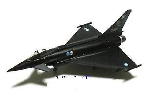
For my vinyl clock, I decided to used white sticker this is to allow a greater contrast compared to a grey which I initially suggested to use. For the surrealism part of my vinyl clock, I have cut out time flies. As if to say, that time is going fast hence to the fact that there is a plane located on the clock. I have also used the missiles which are loaded into typhoons as a way to tell the time between the 4 main number (3 6 9 12). I also decided to add the date for when the introductory prototype flight was as a bit of extra to the clock. I would have liked to add more to clock such as engine pieces. But due to the limitation put upon me due to available equipment this was not possible. The actual typhoons are an almost identical trace of a copyright free image found on Google.
The vinyl clock, in my opinion, could have had more content on the clock, but this is down to unforeseen circumstances, such as the laptop in which I was using to design the clock decided to catch fire. I personally found the missiles to be the hardest part to cut out of the white sticker due to the complicity of the cut making it rather fiddly to do. The centrepiece of the clock is, from a cheap clock at Q&D, where I simply removed the quartz clock piece and inserted it into the clock as seen above.
The typography at the top of the vinyl clock was originally going to straight, not in attic form, but I found that I liked this better compared to the straight text.
The image to the bottom is the image in which I traced to create the typhoon on the final clock piece.